Adventures in Saddle Seat

Stepping Stone Farm rider Reagan Upton is on the U.S. Saddle Seat World Cup Team. She is sharing her story. Welcome Reagan.
Part 1 [Have Saddle, Will Travel]
Part 2 [First Team Practice]
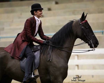
Part 3 [Three-Gaited & Five-Gaited]
Part 4 [Do I Miss Equitation?]
Not many of us have the opportunity to represent our country in international competition. Do you have a question Reagan to address in future posts?
~~~
The World Cup team riders are from all over the country.
Midwest 50%, South 35%, West & West Coast 15%
Midwest: Wisconsin 2, Illinois 2, Indiana 1, Ohio 1
South: Louisiana 2, Alabama 1, Kentucky 1
West & West Coast: California 1, Arizona 1
The coaches change for each World Cup. They have to apply just like the riders do. This year’s coaches are from Illinois and New Jersey.
So, in order to get everyone in one spot there is a lot of traveling involved. Practices had to be strategically planned in order to find a weekend where everyone can attend. They were mandatory but they gave us the option of two different weekends to choose from and whichever the majority voted was the weekend we had practice. We did this for both practices. We also needed locations where there would be enough horses for us to ride.
The first practice was in New Orleans at Cascade Stables. New Orleans is a 5 1/2 hour drive for me, close enough so I was lucky enough not to have to book a flight for this practice. We traveled on Friday, rode on Saturday afternoon, and then traveled back home Sunday.
The second practice was in Tampa held at the Gasparilla Charity Horse Show at the Florida State Fairgrounds. Unfortunately, this practice was scheduled the same weekend I had planned on attending a horse show in Clemson, SC. Missing the horse show was not an acceptable option. I worked it out where I could show in Clemson earlier in the week and still make it to Tampa for practice.
Wednesday – Birmingham AL to Clemson SC. I flew from Birmingham to Greenville and then rented a car and drove 1 hour to the horse show.
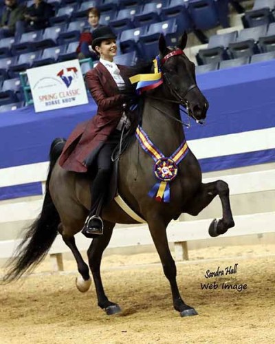
Thursday & Friday – I showed Jimi twice on Thursday and once on Friday. We were 1st, 2nd, and 1st, in that order.
Saturday – Clemson to Tampa FL. Shuttle from the airport to the hotel. The team van drove us from the hotel to the practice. We had to be in Tampa Saturday night in order to be ready for practice Sunday morning. Practiced lasted about four hours. Sunday after lunch we were free to travel back home.
Sunday – Tampa back home to Birmingham. I was home by 7:00 pm.
It was a wild weekend of traveling but totally worth it.
We only had two practices. I think it was enough. Two practices gave the coaches an idea on what type of riders we are and which type of horses we ride best. I wouldn’t change anything logistically.
The World Cup competition will be held in Lexington, KY. Lexington is close enough to drive so I get lucky again and get to avoid the airports. Stepping Stone Farm is lending three horses to the competition and my mom has agreed to haul them up there. So I will be traveling to World Cup in a truck and trailer.