No horses today. This is the Touch of Geek part of the program.
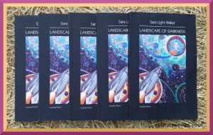
I knew Sara a long time ago in a barn far, far away. Since then she has become an author and illustrator, among her many talents. She has agreed to tell us about her new book. Author info below. Giveaway info below that. Welcome Sara.
~~~
“We need to remember that humanity can do its own saving.”
Landscape of Darkness: Creating Stability in a Time of Chaos
By Sara Light-Waller
I called my hero, Sam, because I was tired of science fiction names that sounded like the author was either stoned or had numb lips. The surname Mercury seemed natural for a space hero, although most people think of Freddie Mercury of Queen and that’s okay too.

Artwork Copyright, Sara Light-Waller, 2018
The title, Landscape of Darkness, came to me immediately, which I took as a good sign, especially for a book that I never planned to write.
Designing a landscape
The whole thing began as a series of illustration samples I prepared for an art class. I’ve been a book illustrator since 1993 and I’m an expert style copyist — a skill I continue to develop. One of my favorite art styles is science fiction magazine art from the 1920’s to the 1950’s. Most is hackneyed and there’s a wide range of quality, especially in the interior art. But if you look past the tired content you’ll find artists well-worth notice. Earle Bergey, Alex Schomburg, Edd Cartier, Frank R. Paul, Hannes Bok, and Virgil Finlay are just a few of the notable artists from the pulp era.

Earle Bergey cover
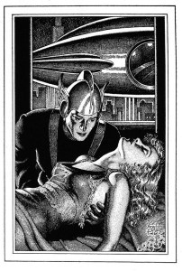
Interior art was almost done in black and white — pen & ink, pencil, or waxy pencil on a textured paper called coquille. The latter technique is little used today, but useful for creating texture patterns, similar to stippling in pen & ink, but with much less time and effort. I planned to demonstrate coquille to my class and had prepared three illustrations — a soviet-era power station, a 1920’s starlet, and an elegant 1930’s touring car — as examples.
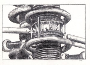

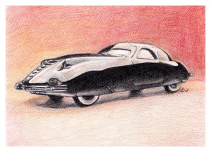
It struck me that the pictures made up a story. The power station looked a lot like a space station, the beautiful woman had been kidnapped and needed help, and the car…? The long lean lines are pure Art Deco and reminded me how much I love streamline design. Interestingly, this created a gestalt in my head that linked the pictures together. I went through the usual internal monologue of who, what, where, and in this case … why bother? The answer came as further inspiration — to digitally combine the power station and the girl into one image and use it for a pulp science fiction-style layout. The story began to take shape through the design, including the title and main character — Landscape of Darkness, featuring Sam Mercury of the Space Patrol.
I added the combined image to a single page magazine layout reminiscent of Thrilling Wonder Stories from the 1940’s. Initially, the text ended after the subtitle, The Lost Patrol, so the next stage was to create placeholder text. That’s when the Art Deco inspiration kicked in. I imagined a fabulous Art Deco city — Neohatten — with a retro-future spaceport and a tough local police captain. Then…I was done. There was never meant to be any more.

Artwork Copyright, Sara Light-Waller, 2018
I showed the page to a friend who’s not a science fiction fan. I expected a polite, “hm huh” and then a return to the previous conversation. But that’s not what happened. He read the tiny bit of story and said, “where’s the rest?”
I frowned in puzzlement. “What do you mean, where’s the rest? There is no more.”
“But there must be more.” He pointed to the page. “What does Sam Mercury do next?”
“Hell if I know,” I said.
I began writing the next day.
Looking to past for future vision
I proudly admit to being a sci-fi nerd especially when it comes to pulp-era science fiction stories. I’ve read nearly everything by Henry Kuttner, no mean feat as he wrote under multiple pen names and in several genres including science fiction, horror, and mystery. I’ve a library well-stocked with musty copies of Edmond Hamilton, Fredric Brown, Murray Leinster, C.L. More, Leigh Brackett, and E.E. “Doc” Smith. (Please don’t be mad that I left out Asimov, Bradbury, and Heinlein, I recognize their brilliance but it’s a personal taste thing.)
With all those old pulp-era stories stuffed into my head is it any wonder that I wanted to try writing one? The first thing task was to think about how to update the style for modern readers. Certain WWII-era literary conventions no longer work while others had a chance of both being useful and wonderful.
Pulp-era stories ran short, much shorter than modern novels. I felt that with blog-length attention spans and lack of free time, short form stories would be perfect for modern readers.
I’ve always liked the idea of strong heroes and in the pulp era this generally meant a human being (and despite what most people think, female pulp heroes were often bright, strong women.) Many of our sci-fi heroes today are meta-humans, cyborgs, or supernaturally-enhanced beings. For this reason I think that we have a hard time relating to them. In the older stories you felt that you could be the hero/heroine and that made you feel good.
I had no trouble designing Sam Mercury as a pulp-style hero. He’s a police captain, the kind of cop you’d want in your own town. He got a lot going on beneath the surface, but is gruff and no-nonsense on the outside.
In pulp stories humanity comes out on top. The robot never wins and the supernatural or alien force is probably out to get you. Much contemporary science fiction has reversed this trend. I think we need to reverse it again. People do not feel good about themselves. And why should they? The world is continually rocked by political chaos, war, and biohazards. Social media throws data at us so fast that we don’t know which stream to follow. We don’t need more chaos and we don’t need a savior in a red cape from another planet. We need to remember that humanity can do its own saving.
Landscape of Darkness takes place two hundred years in the future after a devastating world war. The Cyber-Threshold War destroys most of Earth’s population. In the aftermath, mankind moves away from artificial intelligence technology.
Their future is a place of renaissance where science, spirituality, and quantum physics are blended into technological development. There’s space travel and wisdom about the ultimate futility of war. My future isn’t utopian but mankind has developed a sense of responsibility for itself and its worlds.
Art Redux
Many people assume that an illustrated novel is the same as a “graphic novel.” Not so. A graphic novel relies heavily on pictures to tell the tale. An illustrated novel is a book with limited pictures, chapter and other incidental decorations. It relies on the words, not pictures, to tell the story.
(Because of formatting challenges, the electronic version of my novelette has fewer illustrations and none of the chapter decorations. I wish this could be otherwise, but it is what it is.)
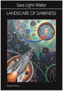
I spent months working on the book cover — subject, design, how to paint it, and with what media. Authentic pulp book covers use palettes stressing two of the three primary colors, usually red and yellow, and containing several of the following elements — rocket ship, space-suited figure(s), planet, B.E.M. (Bug-Eyed Monster), and beautiful girl/woman wearing a space bikini and transparent cover-all.
Despite the continuing popularity of pulp-style cover artwork, I knew that using it for my novel would give it a “shopworn” look.
Unfortunately, modern science fiction book covers didn’t appeal to me either. Combined with my black and white interior illustrations, a slick, photo-realistic book cover would have looked like lipstick on a pig.
My only rational choice was to create something completely different. I wanted a design that was retro-future, but also forward-thinking and cool. Synchronicity brought me just the inspiration I needed in the form of a Tibetan Star map.
It occurred to me that if you’re navigating the galaxy through transdimensional tunnels your star charts might look like something like this — elaborate circular forms representing portals with charting coordinates and other vital star information encoded within the decorations.

Artwork Copyright, Sara Light-Waller, 2018
The medium was a bit tricky. To get the right brightness I chose fine art crayons and colored pencils on black paper. The original art piece is large and I’ve used only segments for the front and back covers. People who’ve seen the original artwork stare at it intently. It suggests a numerical language and coordinates which are not actually meaningful but seem to be. The entire piece is a story — one segment shows the Lucen system another, the transdim portal through the sun, and finally the green gas sargasso of the Delta sector.

Artwork Copyright, Sara Light-Waller, 2018
Creating Landscape of Darkness has been a privilege. I have no idea if it will be successful but I do know is that it’s a combination of things that I love — classic illustration, pulp adventure stories, and space opera — paired with my speculative ideas of how the future might look two hundred years from now. Every artist has their own vision for such things, and some people get closer to the truth than others. I may be one of those people, I may not. But what I will be is someone who had the courage to speak her truth even in a marketplace that pushes for the familiar and the comfortable.
~~~
Author Info
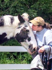
Sara Light-Waller is a freelance writer and illustrator. Also, a life-long horse person who’s bred and trained racehorses, competed in dressage and eventing, and been a practicing human and animal massage therapist for more than twenty years. Her writing website is saralightwaller.com. Her illustration and design website is flyingponystudios.com.
You can find out more about Landscape of Darkness at Lucina Press and buy it on Amazon. You can connect with Sara on Twitter (@saralightwaller), Facebook (Sara Light-Waller), Instagram (Sara Light-Waller) and on Flickr.
~~~
Back to RS
Giveaway Details
First five to comment here win a copy of Landscape of Darkness. I went with multiple copies, since I have proven completely incapable of choosing winners in the past [700]. US addresses only, due to postage costs.
No backroom deal. Bought books from Amazon as I believe in supporting artists. In order to have them in time for this post, I was not able to get signed copies.
Thank you for reading,
Katherine Walcott