Images
Art of the outside world. The Met: Chroma: Ancient Sculpture in Color. Check out the tabs for Visiting Guide & Exhibition Objects.
~~~
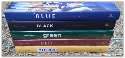
X, History of a Color by Michel Pastoureau, Princeton. Had Blue & Black. Splurged on the rest of the rainbow. Hence the shiny covers. They are sitll in plastic. White has been pre-ordered for next year. In honor of this, I went through blog photos looking for color.


“Whenever I see blue duct tape, I think of you.” [What Makes You, You? A Blog Hop.]
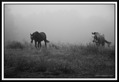
Black & white photography. Photo by me. Post-processing by McKinney Photography. [Foto Friday: Morning Mist]


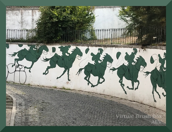

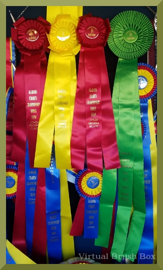
Photo by Ginni Bush. [The Return of Doctor Whooves, FCHP Schooling Show, April 2021, Guest Photos II]
[Green Horses on the Wall, Lisbon, Portugal, Guest Photo]
“Seeing what I could do with a single color.” [An Exercise in Green]
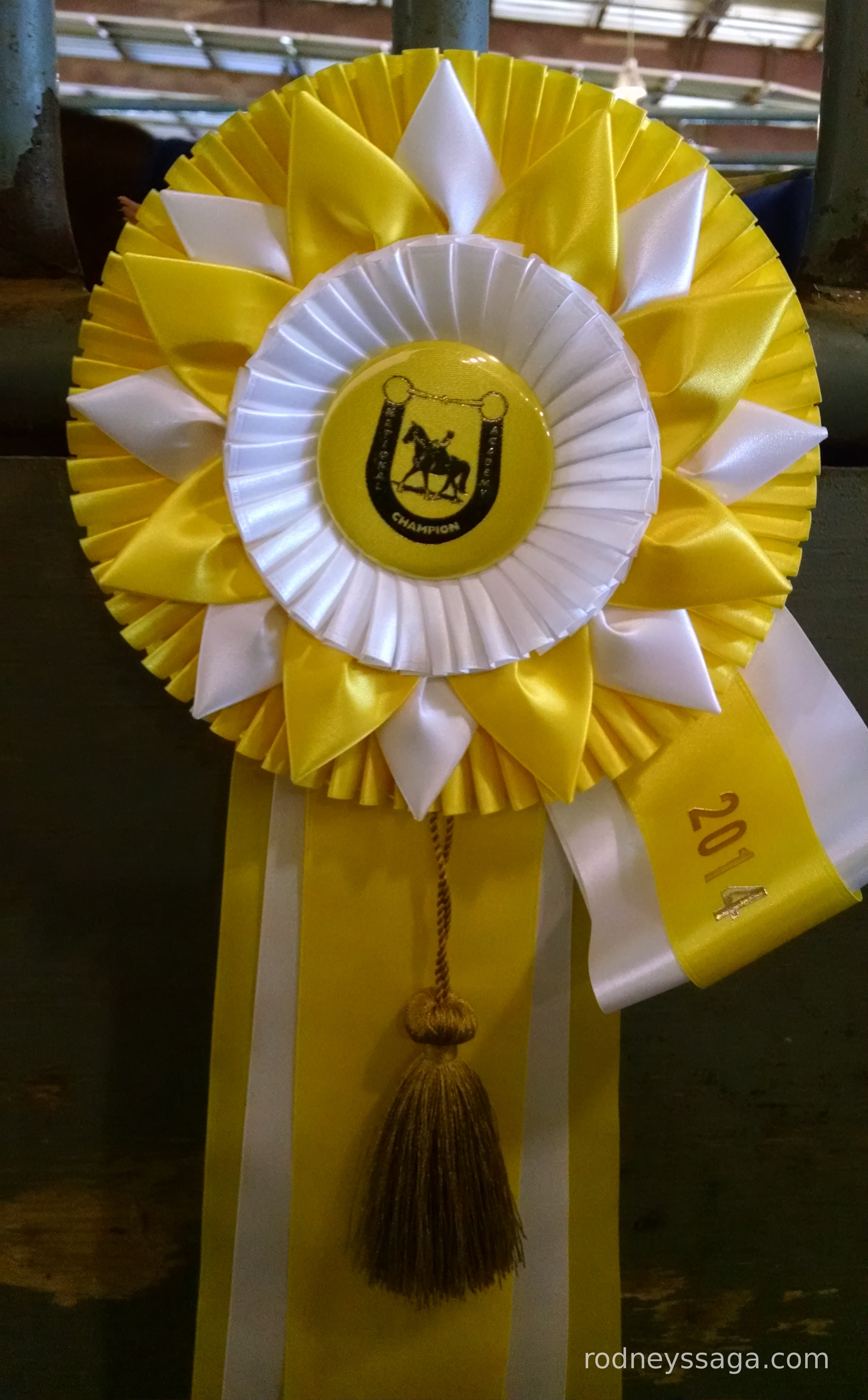
“BTW, the green ribbon measures 41 inches from crown to tip.” [Putting The Show In Showmanship, Show Report, Alabama Charity 2019, Riding]


[Milton SitRep, Saddle & Supplements & Success]
[The Canadian Horse & The Red Queen Take Second, Show Report, Alabama Fun Show #1 2018, ERA Stables]

[Show Report: Important Questions from NACHS 2014, Part 2]
What I Learned
Finding color photos – Easy.
Finding photos where the color was significant – Hard.
There are 11 years of blog photos to chose from. Aside from a few arty shots, all of them are in color. Most of the time the color was incidental.
Pastoureau’s examples are mainly paintings, which are a) the historical option & b) where each element is a choice.
In day-to-day life, we may wear a shirt because it is the requisite level of formality/informality, comfortable, &/or clean. Color is secondary, at least in my life.
Similarly, unless one shows Palominos or Paints, horse color is incidental to attitude, performance, level of formality/informality, comfort, and so on.
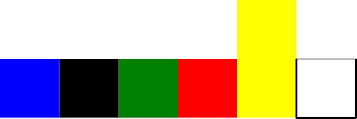
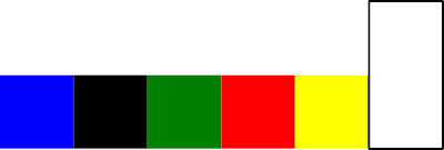
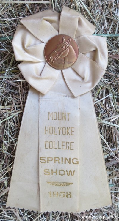
So I ended up with 1) ribbons, where the color of the object is part of the meaning of the object. Change the color, change the object, and 2) team shirts & saddlepads.
Onwards!
Katherine

What’s the story of white? Before you were born?
Riding in a past life?
The theme music for one of the Disney tv shows, just after switching to color: the world is a carousel of color, color, color, color.
Pictures of colors a delight, and I love the b&w one. The colors around here lately are distorted through a lens of humidity that makes the very air seem to wave.
Anonymous is me- debandtoby – don’t know why it’s hating me again.
White ribbon, click on link below, although I really ought do a longer post.
~~~
I’m old enough to remember the change from B&W tv to color. Looks weird now, but was no big deal then. I think our minds may have unconsciously supplied color to help interpreted the images.