Lettering of the outside world. “I’m best known in comics as a letterer …” Todd Klein, home page. [D is for Davis]
~~~
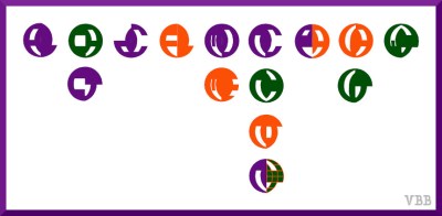
AL, CA CT, DC, FL, MD ME, NC NH NJ NY, PA, VA VT, WY
Made a map of the places in my life. [I-Wish-I-Could-Draw Graphic Memoir, Places Segment]
On the map, states are indicated with circles and letters. At the time, I used a font provided by Inkscape. Redid the lettering.
Process Notes
The graphic memoir project has lost momentum for the moment, so I stopped with a sketch of the idea. Interest was low on grinding to turnout a finish product. There are adjustments I would make if I stayed with this design.
Considerations for the future if I decide to get back to this.
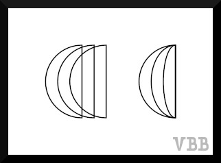
Consider changing the underlying grid. Instead of parallel curves, have them go pole to pole.

This would solve the problem of letters, such as L & T, not matching their counterpart and having to be stretched. Not sure where the white lines came from. Not visible in Inkscape. Showed up in Gnumeric. Tried to fix once. Letting it go … Letting it go …
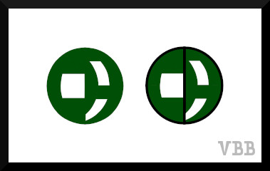
Consider outlining the letters. Makes them more legible. Or do I want to stay with the abstract? Map context might be sufficient.
Onwards!
Katherine

