Images
Awareness of the outside world. While we are on the subject of images. At my appointment last week, the dentist took an impression for an onlay. Think of it as a shallow crown. Instead of asking me to bite into a hunk of softened chewing gum, they scanned my tooth and the environs. The bionic part will be made from the scan. Digital dentistry. Welcome to the future. [Wednesday]
~~~


Design Notes
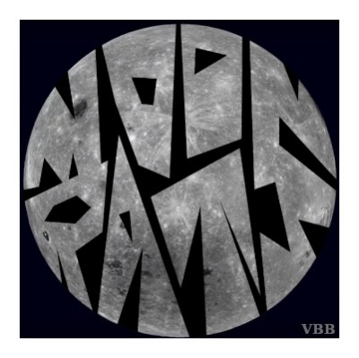
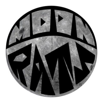
Spent way longer on this than the results might indicate. Started with all diagonals. Round moon versus sharp, jagged letters. However, the pointy Os looked too much like fangs, which was more of a rat statement than I wanted to make. Made the Os square. Put slightly rounded corners on everything. Hello 70s. Square grid wouldn’t work with a circle as the base shape. Tried axonometric, i.e. triangular, grid. Got nowhere. Internet surfing says that the axonometric is mostly used for creating perspective.
The background image is the darkside from the NASA archives. If I ever did anything commercial, I’d want this to be a drawing. Something I can envision but not execute. Photo source & credit – NASA Solar System Exploration: Earth’s Moon, Galleries Lunar Far Side, NASA/Goddard Space Flight Center/Arizona State University, 2019.
The question I could not resolve was whether the two pieces of text should be treated the same or differently. The first is a more unified identity. This is who we are. The second approach introduces contrast/conflict/balance into the heart of the culture. We are several things at once. Both have advantages.
Process Notes
Inkscape. Learned how to use Path > Difference for the silhouette letters. Used Object > Clip for the circle. From pen tool drawing. No grid. Go me. GIMP for reformating & watermark, per usual.
Stay safe. Stay sane.
Katherine
The second one gets my vote 🙂
The second one has my vote too. Much more readable.
Readability. That’s why ya ask other people. I can’t judge that. I already know what it says.