Graphic Design
Process notes
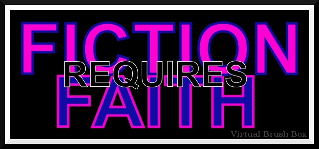
On the down side, still relying on computer fonts, Arial in this case, rather than drawing my own letters. I had envisioned a completely different image based on swirly, swoopy initial letters. F & R seem to lend themselves to swoops, don’t they? However, I couldn’t get the Inkscape spirals to behave and knew I couldn’t freehand with either pen or computer. Insert Ira Glass’s Advice For Beginners quote once again, [Definitions] Zen Pencils.
On the upside, had fun discovering two-tone letters.
Thank you for reading,
Katherine Walcott
