Art of the outside world. Monument Lettering Center: The Lettering of Lady Liberty.
~~~
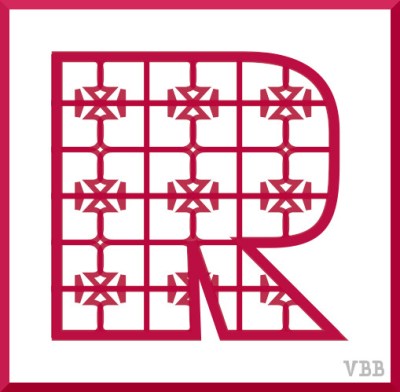
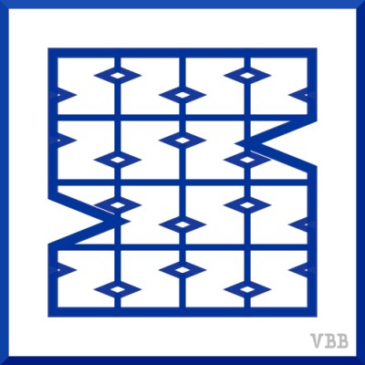
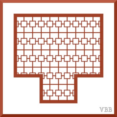
Colors: raspberry, smalt (seems similar to sapphire), titian.
Color Comment: Raspberry freehanded from the color wheel. Anyone else have trouble getting colors to look the way you imagine them? I feel that I am the chromatic equivalent of tone deaf. Smalt & titian sampled from article, Merriam Webster: 10 Words for Uncommon Colors.
Project Description [Colorwork Alphabet Introduction]
Project Archive [Colorwork Alphabet]
Onwards!
Katherine

Titian I’ve heard of, smalt, not. Do you mind some criticism? The R is good, but the S needs more definition and the crossbar of the T should be narrower in relation to the upright. I’m sorry, I’m an artist, and these are just what strikes me. I admire you no end for continuing to work on your art.
As letters in their own right, yes, I probably would do something different. Here I have deliberately made the outer letters with as much area as possible, in order to show more of the pattern. That’s the theory. Thanks for the thoughts & thanks for calling it art!
You’re welcom.
Welcome.