Art of the outside world. The Color Palette Company, cities as collections of colors. They do a nice job. I would order, but I am trying to be where I am rather than thinking about where I am not.
~~~


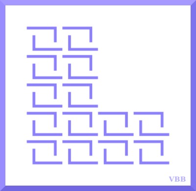
Colors: jade, khaki, lilac
Project Description [Colorwork Alphabet Introduction]
Previous Posts [Colorwork Alphabet]
Onwards!
Katherine

I had to log in to leave a comment. That’s never happened before.
I think the upright on the J should be a hair taller, and the top crossbar a hair narrower. The L is kind of just floating there, the proportions seem a bit off to me. I really like the K, you did a really good job on that. I’m glad to see you’re keeping on with this, even if I do criticize.
Criticism welcome. I love to geek out about letters. Overall design elements are square letters for the outline and as much open space as possible in the external letter to show the internal design. Which is how I got where I did. The lower inner bar could be dropped down, which would make the right inner space a multiple of the left inner space, as well as making the upright appear longer. The K did turn out well, which was solely due to last minute changes to make the interior design look better. Not at all what I had planned. Quite happy with result. No L outline so that it doesn’t interfere with drop shadow images that I kept seeing. Am planning a second L more in keeping with overall design next time. Thank you!