Views of the outside world. EarthCam: Top of the Rock & NYC Live Cam: Empire State Building. For giggles, ESB: Exhibits, scroll down to Kong.
~~~
Moving forward with post-production of photos. This month, pushing buttons as a way to ease into the process. Two from the color menu. One from the filter menu. [Step Zero, Photo Editing]

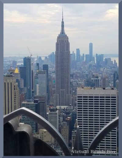
Original, reposted. [When?]
Colors > Saturation. Low. A little bit more what it looks like IRL. Some areas, such as the mid-ground and street level, look better. Some areas, such as the background, look a little too blue. I suspect the answer is to adjust the blue as well. I will leave double buttons for a later effort.
Hard to see the difference unless compared to the original.
Colors > Saturation. High. As an intentionally weird effect.

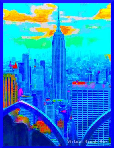
Colors > Threshold. Mostly an effect. Adjusted a bit darker to bring out the central building.

Filters > Light & Shadow > Supernova. Used the base color and shape for the nova. Another artistic effect.
Thus ends today’s effort. Result, one serious, three goofy. Lessons learned. I can see the point of the serious. The goofy is more fun.
Previous Post Production Ponderings
[Foto Friday: Spotted in GIMP] 2013
[Pondering Post-Production Processes] 2020
Maybe this time I’ll stick with it.
Onwards!
Katherine

Great shot. No other island quite the same.
Joan
🏙️
Nice photos. And cool Kong. I haven’t been in NYC since 80something, unlikely I’ll be there again. I was born in Manhattan.
I was born in Connecticut, but got to NYC soon enough that my earliest memories are from there.
It doesn’t matter, to me, what the occasion, reason, story, movie, tour promo — just seeing a photo of the Empire State Building makes me happy. Thanks — MM
🏙️