.Awareness of half the sky. ARTnews: 12 Women Old Masters to Know, Chernick, July 21, 2025.
~~~

Original, repost [E is for Electrum with an Ebony Edge]
Comment, “I would have made the middle bar of the E a bit more defined.” debandtoby.
I made the change. Completely correct. It did look stubby.

Initial variations. First, longer middle bar, two starbursts instead of one. Third, longer white space, body has three starbursts instead of four. Middle, combo. (Description updated from initial post.)
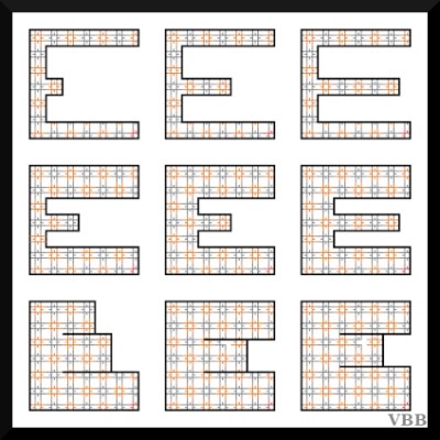
Secondary variations. A little of this, a little of that.
The square shape of the letter is not evenly divisible by the inner pattern. Do you make the letter even, lower middle, or align with the pattern, lower right?
Process Notes
This was was gonna be an update to the original post, but a) interesting & b) anything for a blog post. Once I came up with that idea, tried a bunch more, exploring how each change effects the overall feel of the letter.
Project Description [Colorwork Alphabet Introduction]
Previous Posts [Colorwork Alphabet]
Onwards!
Katherine

It does look more like an E. Gee, ain’t I inspirational? LOL