Art of the outside world. Istanbul Modern.
~~~
Process Notes
What could be more city than graffiti?
I was going for something that could be executed swiftly & fluidly.
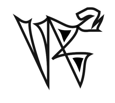
My first iteration had the bottom of the V & the B coming together at a point. Then I started wondering if I was channeling the Warner Brothers logo. So I turned the B the other way. Then – perhaps the under the influence of cartoons – I saw the branches of the Vs as duck feet and could not unsee it.
Time for a redo.
I went through 37 iterations, although I do save versions early & often. I never know when I will want to go back a few steps. Contrary to my usual design habits, much of this was drawn by eye rather than onto a grid. I did use guides to line up points, thinking it might give an underlying structure.
Things I learned

A slightly shallower curve makes the ends pointy. In the past, this was an attribute that popped up randomly where I didn’t want it and then I had to figure out how to get rid of it or to live with it. This time, it was an element I wanted to keep and had to adjust the curves carefully to make sure I didn’t lose the points.
Which goes to show that different features have their place. This was the WB/duck foot version.
Pointy bit management also figured in the final design, There is the slightest bulge in the bottom left of the V. Turns out that a straight line made the bottom point go away. Conversely, getting a point on the middle bar of the B meant losing the shape of the middle interior space. I decided this was where a marker would be going one way and then reversing the other way, so a blunt end made sense. Apparently designs have internal narratives.
Inspiration
Current online class, UC Graham: From Istanbul to Cairo: The City in the Historical Novels of the Middle East. Was on hiatus, hence generalized city instead of Cairo or Istanbul.
Onwards!
Katherine

One thought on “Graffiti Logo, Graphic Art”
Comments are closed.