Awareness of the outside world. “As Advent progresses, these ornaments unlock to show a short, animated story, or a fun activity or game!” Jackie Lawson Digital Advent Calendar. I did not purchase. I mention it bc I like the idea of something that CANNOT be produced physically. The Internet needs more of this. Movies are not stage plays filmed from the orchestra pit. The internet is not digital paper.
~~~
Fractals were a hoot. Thanks again to Gement for getting me started on this project. Overall post [Fractal Alphabet & Numbers], archives [Fractal Alphabet].
Recap


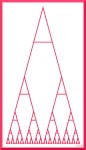
It started with shapes. [Fractal Triangle] [Fractal Square]

It ran from A to Z. [Fractal Alphabet A] [Fractal Alphabet Z]
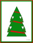
Took a break for the holidays. [Fractal Christmas Tree] [Fractal Gift Boxes]
It ended with numbers. [Fractal Numbers Second Sequence]
Process
Beforehand, I did not search on fractal letters. I did not want to see what other folks had done.
No attempt at unity. Each letter taken on its own.
I tried for designs that created a larger pattern rather than just sat there as a a pile of letters.
Shapes first. Then tweak dimensions. Then choose colors.
Kept trying for new.
Fractal in the sense of repetition and reduction. Not mathematically fractal. [Fractal Alphabet A, discussion]
Results – Things I Discovered
905, 80%, 70% is different than 90% of 90% all the way down, because math.
Filling the letters visually preserved the form of the letter, otherwise letters such as T or X became simply a mass of crosshatching.
Some letters generated multiple viable alternates. Some were one & done.
Letters that are a mix of straight & curve lines always give me the hardest time.
Reasonably successful at come up with new ideas. Sometimes the repetition was deliberate, below. Sometimes the repetition happen became the first one was many letters in the past, A & M. I was pretty good about not simply flipping letters that are reflections of each other C -> U or M -> W.
Watch out for inadvertent shapes. Anything triangular can quickly become a Jewish star. Similarly, I had to be careful working with L & T. I kept getting crosses or swastikas. There are only so many shapes in the world.
Noted From Individual Letters

A. This was the original A. The one above is an alternate. When I was designing the A, all I saw was the curve. Once it was posted, the upper negative space looked like cleavage. Once seen, could not unsee.
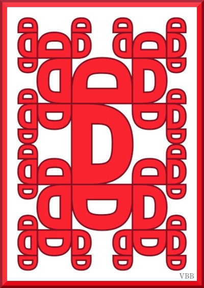
D. A Mayan aesthetic, to me.


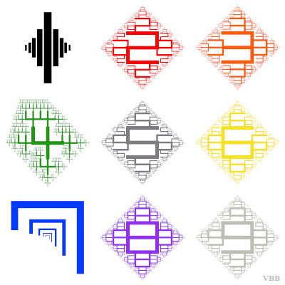
H. 4 iterations in color was too much. 3 iterations in color is okay. 3 monochrome iterations is boring.
I. I liked how it looked as H. I did not like how it looked as I. Weird.
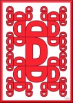


Repeating the same idea with a differently shaped letter led to completely different vibe, e.g. D&E, U&V.[Fractal Alphabet]
Onwards!
Katherine

That’s a lot of work!
But great results!
Jane
Thank you.